On this page:
Home Screen and Top Navigation
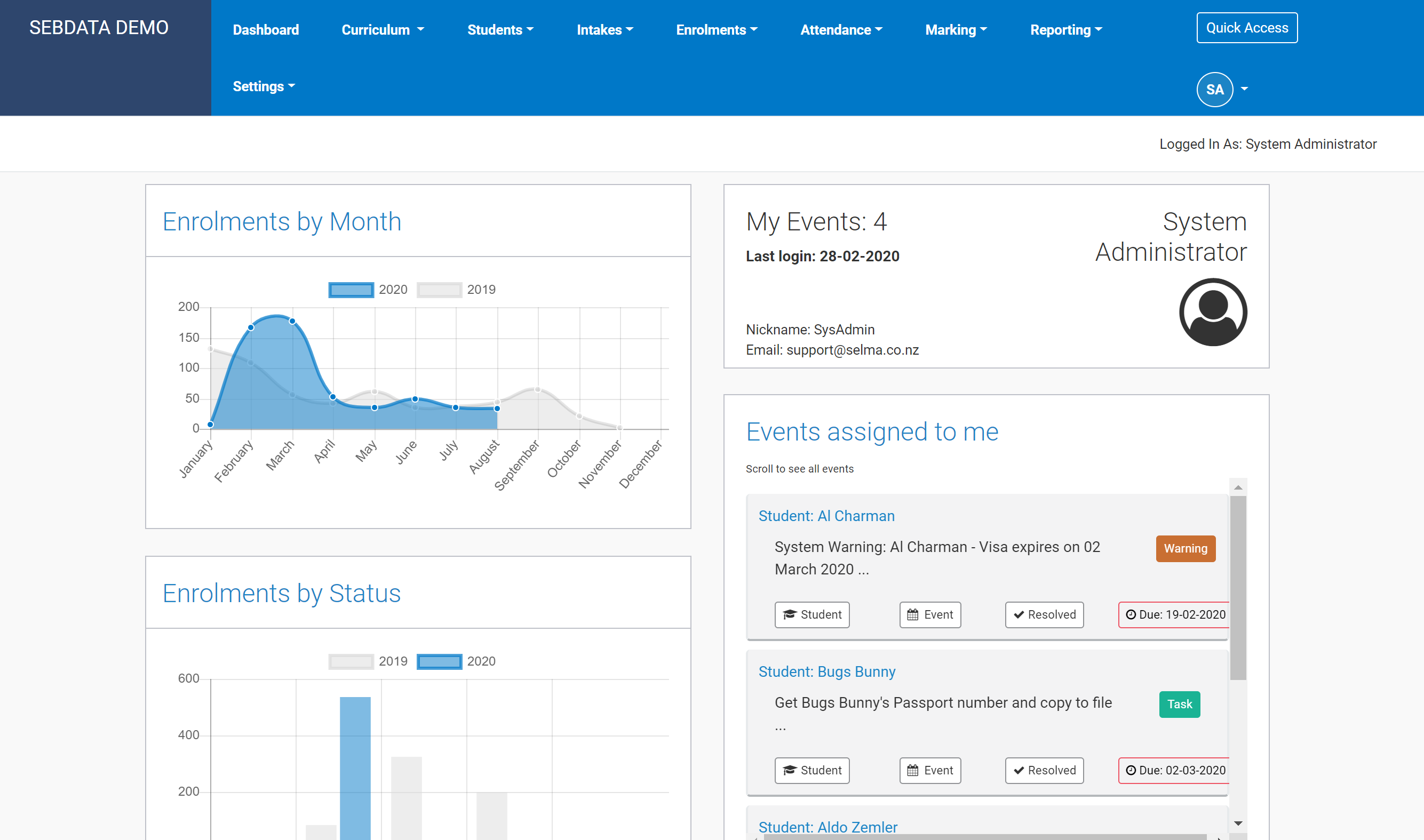
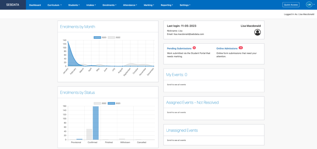
SELMA’s layout is streamlined and easy to navigate. When you log into your SELMA account, the homepage displays a dashboard as demonstrated on the image below.
The left side of this screen provides insights into key performance indicators, while the right side displays cards that allow dynamic interaction with what SELMA calls “Events”.

The top navigation tabs have been designed to resemble the order in which you will interact with SELMA. They have also been structured in a way that ensures that each section is set up correctly in order for the next to become accessible/functional.
- Dashboard
- Curriculum
- Students
- Intakes
- Enrolments
- Attendance
- Marking
- Reporting
- Settings: this section should be populated first and as accurately as possible as it contains all Master Data. For further details please refer to System Settings.
Dashboards
Main Dashboard
This is SELMA’s main (standard) dashboard which displays key performance indicators specific to your education provider.
In the May 2023 release, the SELMA dashboard was updated to notify users when students have uploaded assignments for marking via Student Portal and Admissions received via the Online Admission Forms (applicable to those clients who subscribe to these services).

Tutor Dashboard
Tutors have access to a streamlined version of SELMA, specifically designed to focus on essential daily functions that are relevant to teaching staff.
By eliminating administrative complexities and highlighting classroom-focused features, this version enables educators to efficiently manage their teaching responsibilities without navigating through unnecessary functions intended for administrative personnel.
SELMA users with tutor level access will see the following elements on their dashboard:

| TOP NAVIGATION |
|---|
| This simplified interface enables teachers to navigate through essential functions: – Manage Students – Manage Intakes and Classes – Manage Enrolments – Attendance marking per intake and class – Marking and grading |
| TUTOR DASHBOARD – LEFT SIDE | TUTOR DASHBOARD – RIGHT SIDE |
|---|---|
| Enrolments Information – Pie graph of enrolments, displaying the percentage of enrolments per status. – Information pertaining to attendance %, time in programme % and progress % – Number of domestic and international students related to that particular user. | Teacher details – Last login – Name |
| Class Information Table of active classes assigned to that tutor in SELMA. | Portal Submissions Displays notifications when students have uploaded assignments for marking via Student Portal. |
| Intake Information Table of active intakes allocated to the tutor displaying: – Intake code – Intake name – Total number of students in each intake. – Number of students in the intake whose attendance and work needs to be marked. | Events Displays tasks assigned to the tutor. |
Quick Access Menu
Depending on your account’s access authorisation settings, you will find the Quick Access button near your initials on the top right of the screen. The Quick Access menu offers a few handy shortcuts allowing quick navigation to key functions within SELMA.

